Typography Task 2 : Typographic Exploration & Communication
9.5.2023 -25.5.2023 / Week7- Week9
Zhao Guan Mei /0363166
Typography / Bachelor of Design (Hons) in Creative Media
Typography / Bachelor of Design (Hons) in Creative Media
TASK 2 : Typographic Exploration & Communication (Text Formatting
and Expression)
LECTURES
In the past few weeks, we have learned how to use Adobe Illustrator and Adobe Indesign for typography, such as kerning and tracking, use baselines, adjust page whitespace and other skills by watching Mr. Vinod's videos. In this task, we need to use these knowledge to complete a typographic design.
INSTRACTIONS
TASK 2 : Typographic Exploration & Communication (Text Formatting
and Expression)
For this task we will choose one of the three provided articles for layout
design , use Adobe InDesign to typographically compose and express the
text by a 2-page editorial spread (200mm x 200mm per page).
Research
after reading roughly this three article, I choose the article titled "a
code to build on and live by", because the article conveys that designers
should be mindful of the impact their work can have on people and society
as a whole, that's what I agree with and why is this article appealing to
me. The length of this article is also very suitable for my layout design.
In order to better understand how to complete good this tasks, I searched
Pinterest and Google for articles on typography design and editorial
spread typography.
Fig. 1.0 simple of article typography (week 7, 5-5-2023)
Fig. 1.1 simple of article typography (week 7, 5-5-2023)
Fig. 1.2 simple of editorial spread typography (week 7, 5-5-2023)
Based on my understanding of the article, I drew some preliminary sketches
according to my ideas
JPEG. 3.2 Final task 2: Typographic Exploration & Communication with baseline (week 9, 17-5-2023)
PDF Final task 2: Typographic Exploration & Communication with baseline (week 9, 17-5-2023)
Fig. 2.1-2.4 sketches (week 7, 7-5-2023)
In these sketches, I mainly used lines and shadow to emphasize the word
"builds", showing his action form and 3D sense,and I choose the last
one to digitize it and adjust it with text.
Fig. 2.5 layout (week 7, 7-5-2023)
After finished this design, I realized that the
design could not reflect the emphasis on the title, nor did it conform
to the original meaning of the title, and the content of the article was
too common and unfocused.
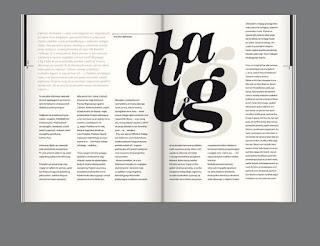
I tried to using Adobe illustrator to change the angle of the heading to
achieve 3D , and then bloded the heading to make it more visually
focused ,and I added a few lines to shift the visual focus and make the
reading smoother, and I also mixed different sizes of fonts “Bodoni std”
to make the typography look more layered.
Fig. 2.6-2.9 process of task in adobe illustrator (week 8, 10-5-2023)
Finally I selected this title and pasted it into Adobe InDesign I have
adujst the place of the text and bold the main points of the
article
Final version of Task 2
Fonts:bodoni std-blod(heading)
bodoni std-book&extra blod (body)
Leading:11pt
Font size:9
Characters per line: 56
Alignment:left aligned
Margins:12mm
Gutter:5mm
JPEG. Final task 2: Typographic Exploration & Communication- (week 9, 17-5-2023)
PDF Final task 2: Typographic Exploration & Communication (week 9, 17-5-2023)
PDF Final task 2: Typographic Exploration & Communication with baseline (week 9, 17-5-2023)
REFLECTIONS
Experience:
Through these typographic exploration and communication exercises, I became more familiar with the steps and methods of layout, I have learned that it is necessary to understand the content of the article before start design, and it is necessary to form the habit of drawing sketches ,I also learned that the design of heading should be related to articles , and the layout should be simple and easy to understand with visual focus.
Observation:
The choice of font is also important for text layout design. Different font styles can convey different emotions and atmosphere. Appropriate size and line spacing can improve readability and make text easier to read.
Findings:
Through task 2, I found that typographic design requires great attention to details. Small typographical adjustments such as fine kerning, line height or alignment, and even punctuation can dramatically improve the readability of text. With practice, I can learn how to optimize them. I can also create organization by using different font bolders, etc., and use elements like lines to guide the reader's view.
FEEDBACK
Week 6
general feedback :focus on the expression then layout,don't make too much elements.
specific feedback:headline design shoud focous the meaning and reduce the use of graphic
elements,choose a suitable font.
Week 7
general feedback:For task 1 ,we have to check and avoid some basic errors, and more
carefully to do the second task.
specific feedback:I have a lot of careless detials and some uploading failed that make me
lossed many marks in task 1, task 2 I have to do some adjust on
topic,let it more accord with the meaning of the article, and can choose
some sentences or words do some special design.
FURTHER READING
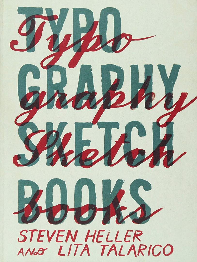
For this furthur reading I read《Typography Sketch Books 》,this book
shows designers' sketchbooks and introduces the art and skills of
typography design and the creative process, as well as art works and some
typography knowledge.
Fig 4.1 sketches and final design simple
Reading this book makes me have a deeper understanding of the creation
process of typeface and the importance of typography. This book shows
various designers' sketchbooks, and I can show designers' creation process
from preliminary conception to final design results in this intuitive way.
Fig 4.3 sketch of Katie Lombardo
Katie Lombardo prefers letterforms are soothing versions of
nineteenth-century woodtypes, painted and watercolored with pastel
tones and happy doodads.
In addition to images and design work, the book also provides a lot of
information and insight about typographic design. It includes the
knowledge of font history, typography principles and technology, which
enables me to understand the background and characteristics of different
fonts, master the basic principles and skills of typography, and have an
in-depth understanding of how to apply these knowledge to my own design
projects.


Comments
Post a Comment