Design Principles Task 1: Exploration
5.2.2024 - 19.2.2024 | Week 1-Week 3
Zhao GuanMei | 0363166
Design Principles | Bachelor of Design (Honours) in Creative
Media
Task 1: Exploration
INDEX
Instruction
Lectures:
ELEMENTS OF DESIGN
PRICIPLES OF DESIGN
VISUAL ANALYSIS
Observation
Instruction
Lectures
Introduction: Elements & Principles of Design
ELEMENTS OF DESIGN
• Point
a simplest element of design, used as repetitive mark forms a line ,can create tow-and three-dimensional figures.
• Line
can indate directions, deifine boundaries of shapes and spaces,suggest motion or emotion,can also be grouped to depict qualities of light and shadow and to form patterns and textures.
• Shape
- refers ro expanse within the outline of 2D area or 3D object.
- Become visible when a line or two lines enclose an area or when an apparent change in value (lightness/darkness), colour or texture sets an area apart from its surroundings.
category :shapes geometric (precise and regular) & organic (irregular)
• Form
- three dimensional area, when form enclosed space called volume.
Fig. 1.2 form in 3D media (week 1 8.2.2024)

• Texture
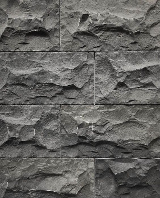
- refers to the tactile qualities of surfaces or to the visual representation of those qualities.
- can be experienced by touching or through visual suggestion.
- category: actual (experienced by touch) & simulated or implied (created to look like the real texture).
Fig. 1.4-1.5 actual texture & simulated texture (week 1 8.2.2024)
• Space
- space is the indefinable,The actual space of each picture’s surface is defined by its edges – the two dimensions of height and width.
Three-dimensional space is experienced when we are in it, from the outside, we experience mass. from the inside, we experience volume.
Fig. 1.5-1.6 mass & volume space (week 1 8.2.2024)
in graphic design, space, or depth, refers to the area that a shape or form occupies. can be
defined as positive (filled space) or negative (empty space).
- The illusion of a three-dimension space can be suggested through depth.
- This can be achieved by overlapping of images, the variation of sizes, placement and perspective.
• Colour
human beings can distinguish is identifiable in terms of just three variables:
- Hue: Colours of the spectrum, e.g. yellow and green.
- Value: This refers to the lightness or darkness from white through greys to black.
- Intensity: Also called saturation or chroma, it refers to the purity of a hue.
A pure hue is the hue in its highest saturation,in its brightest form.
With pigment (black, white or grey) of another hue is added to a pure hue, its intensity diminishes and is dulled.
color schemes
Colour groupings that provide distinct colour harmonies are called colour schemes.
• Monochromatic colour schemes are based on variations in the value and intensity of a single hue.
Fig. 1.7 monochromatic colour schemes (week 1 8.2.2024)
• Analogous colour schemes are based on colours adjacentto one another on the colour wheel, each containing the same pure hue.
Fig. 1.8 analogous colour-blue & green scheme (week 1 8.2.2024)
• Complementary colour schemes emphasise two hues directly opposite each other on the colour wheel.
Fig. 1.9 complementary colour scheme (week 1 8.2.2024)
PRINCIPLES OF DESIGN
Gestalt Theory
- rules that describe how the human eye perceives visual
elements.
- aim to show how complex scenes can be reduced to more simple
shapes and how the eyes perceive the shapes as a single, united form rather than the separate simpler elements involved.
PRINCIPLE OF SIMILARITY
- The human eye tends to perceive similar elements, seems to craft a link between elements of a similar nature.
PRINCIPLE OF CONTINUATION
- The human eye follows the paths, lines, and curves of a design, and prefers to see a continuous flow of visual elements rather than separated objects.
PRINCIPLE OF CLOSURE
- The human eye prefers to see complete shapes. If the visual elements are not complete, the user can perceive a complete shape by filling in missing visual information.
PRINCIPLE OF PROXIMITY
• The process of ensuring related design elements are placed together. Any unrelated items, should be spaced apart. Close proximity indicates that items are connected or have a relationship to each other and become one visual unit which helps to organise or give structure to a layout.
PRINCIPLE OF FIGURE/GROUND
• Objects are instinctively perceived as being either in the foreground or the background. They either stand out prominently in the front (the figure) or recede into the back (the ground).
LAW OF SYMMETRY & ORDER
• This law states that elements that are symmetrical to each other tend to be perceived as a unified group. this rule suggests that objects that are symmetrical with each other will be more likely to be grouped together than objects not symmetrical with each other.
Contrast
- juxtaposition of strongly dissimilar elements.
- provide visual interest, emphasise a point and express.
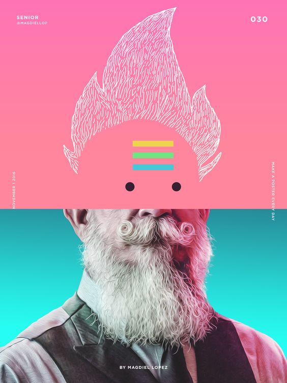
Fig. 1.7 contrast poster (week 1 9.2.2024)
- A design having a focus point in it. To show out its different
- used to create dominance and focus in a design work.
- Colour (bright & dark), size (big and small), shape (round and
square), and value (more and less) are the common elements used to
create emphasis.
Fig. 1.8 emphasis poster (week 1 9.2.2024)
Balance
- refers to the distribution of visual weight in a work of design.
- it is the visual equilibrium of the elements that causes the total
image to appear balanced
- balance can be symmertrical or asymmetrical
Fig. 1.9 balance poster (week 1 9.2.2024)
Repetition
- repetition of elements of design creates rhythm and pattern within the
work.
- variety is essential to keep rhythms exciting and active, and to avoid
monotony.
- Pattern increases visual excitement by enriching surface interest.
Fig. 2.0 repetition principle poster (week 1 9.2.2024)
Movement
- lesds the eye in ,sround and through a composition-the path the
eye follows.
- It creates a visual image when the object seems to be moving in s
visual image.
- commly create by shapes, forms, lines, and curves in visual images.
Symbol
- A sign, shape,or object that is used to represent something else
- Can provide ot convey information,equivalent to one or more sentences
of text or even a wgole story.
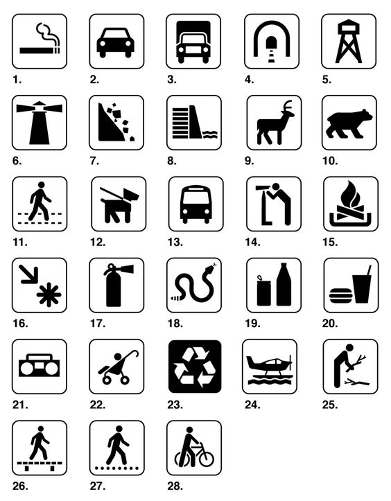
1. Pictorial symbols: Image-related and simplified pictures.
Fig. 2.1 pictorial symbols (week 2 17.2.2024)
2. Abstract symbols: Look like the objects that they represent but have less details.
3. Arbitrary symbols:
Arbitrary symbols have no resemblance at all to the objects or the ideas they represent.
The symbol is invented with the meaning constructed.
Many are based on geometric shapes and colours.
Fig. 2.4 Arbitarysymbols (week 2 17.2.2024)
Word and Image
- use suitable and relevant images viewers are able to relate to a
concept or brand
- suitable typeface and strategic positioning od the type will result in
visual hirerarchy and balance in a work of design
- typography is the design and arrangement of text to convey a message or
concept
Fig. 2.5 word and image principle poster(week 2 17.2.2024)
Visual analysis
In its strictest definition - a description and explanation of visual structure for its own sake.
Visual analysis is a critical part of visual literacy, a skill that helps people read and critically interpret images.
visual analysis work progress:
Phase 1: Observation
Phase 2: Analysis
Phase 3: Interpretation
PHASE 1 - OBSERVATION
Observation means closely looking at and identifying the visual elements of a design, trying to describe them carefully and accurately in your own words. Do not read beforehand about the design at all.
The observation phase is about looking, thinking, and finding good language to communicate what you notice.
PHASE 2: ANALYSIS
Analysis requires you to think about your observations and try to make statements about the work based on the evidence of your observations.
Think about how the specific visual elements that you’ve identified combine to create design principles that complete that work of design/art, and the effects on the viewer.
How are your eyes led through the work and why? Apply the design principles knowledge you have learnt.
PHASE 3: INTERPRETATION
In this final phase, your observations, description, and analysis of the work are fused with facts about the design work (and in some cases the designer) and historical context that you find in trustworthy published sources.
What is the meaning of the design? What was the purpose for it to be created?
Obseravtion
Small Recap
For this task we are asign to Pick and briefly describe one topic from the 17 goals of united nations link here, and select an artwork that revolves around selected goal,and explain the reason for chosen artwork in relation to the UNSDG goal and list the design principles we observed in the artwork.
Selected UNSDG | Goal 15 - LIFE ON LAND
I chose goal 15- Life on land , which aims to protect, restore and promote sustainable use of terrestrial ecosystems, sustainably manage forests, combat desertification, and halt and reverse land degradation and halt biodiversity loss.
Artwork design analysis
Fig. 3.1 artwork from pinterest ( week 1 8.2.2024)
Title : Palm oil and deforestation
Designer : Izabela Kurkiewicz
Year : 2017
Size : 118 KB
Medium : Mixed media
Principels in artwork:
words and imagecontrast
balance
PHASE 1: OBSERVATION
The point of this artwork is the picture on the lift side - bread applying chocolate sauce and the other side of the knife is the forest. The main colors are nigger-brown , green and gray as auxiliary. In this design, the knife as a dividing line shows and contrasts reclaimed soil (chocolate sauce) and forest, The chocolate sauce is also covered with land reclamation machines and fallen trees.The slogan displayed in the right up corner "oil palm plantations are the largest driver of deforestation in Indonesia '' used typography highlights the detrimental impact of palm oil production on deforestation, which contributes significantly to biodiversity loss, habitat destruction, and climate change. By shedding light on this issue, the artwork raises awareness and advocates for the need to address unsustainable practices in the palm oil industry to achieve the objectives of Goal 15, promoting sustainable land use and conservation efforts.
(147 words)
Feedback
Week 2
General Feedback : The main goal of finding an artwork is to identify the principle of the art.
Specific Feedback : There are not enough principles of selected artwork
Week 3
General Feedback : In the interpretation of the artwork , do not mention the principles of design, mainly focus identifying the visual elements and trying to describe them .
Specific Feedback : need to brief your chosen goal and add pictures to your lectures notes.
Reflection
Experience : It was a interesting experience!From the beginning, I randomly selected some UNSDG-Goals and then tried to find suitable works of art for further analysis, but I kept changing the goals because I could not find suitable artwork under the goal. Mr. zeon gave us a good suggestion that we should focus on observe design principles . Looking for a work that can analyze the principles of art, and then connecting it to the existing UNSDG-Goals, that help me to proceed smoothly to the next step of observation and exploration. during the observation, I watch the notes repeatedly to identify the principles in the works of art, and carefully observe every detail in the picture to describe, so as to better understand the artiest's creative skills.
Observation : By watching the tutorial videos and finishing the lecture notes, I have a better understanding of the elements and principles of design, and by observing and looking for various types of art works, I can learn and discover different design principles and skills, which enables me to have a very different experience of appreciating artworks, this is a very good learning.
findings : Through this task, I learned to pay attention to details in artistic works, find elements and techniques that I might otherwise ignore, learn to observe works of meaning from different angles, understand the unique perspective of artists, learn to analyze works, and improve aesthetic taste.
Further Reading
Typography as Discourse Katherine McCoy, David Frej 1988
by Simone Restifo
From the dominance of the New York School in the 1950s to the introduction of Swiss minimalism in the 1960s.
Swiss minimalism: a structural and typographic system that forced a split between graphicdesign and advertising.
1979
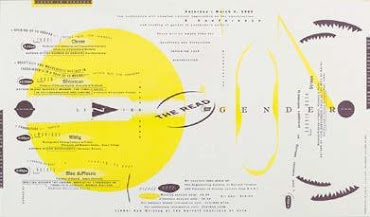
April Greiman (design and typography) and Jayme Odgers (art direction, photography, and design), poster for California Institute of the Arts, 1979.
1987 The impact of digital revolution on graphic design
1990 The Fusion of Technology and Graphic Design April Greiman, Eric Martin
End


Comments
Post a Comment